
Choosing between watercolor and acrylic for relaxation isn’t about which is ‘easier’; it’s about managing your relationship with control.
- Watercolor’s fluidity teaches “intentional surrender,” helping you accept and collaborate with beautiful, unplanned results.
- Acrylic’s opacity offers a “safe container,” allowing you to correct, layer, and experiment without the fear of permanent mistakes.
Recommendation: Instead of asking ‘Which is better?’, ask ‘What does my mind need today: a lesson in letting go, or a safe space to build confidence?’
If you’re a stressed-out adult with perfectionistic tendencies, the idea of starting an artistic hobby can feel both tempting and terrifying. You crave a creative outlet to find your flow state and quiet your mind, but the fear of making something “ugly” or “wrong” can be paralyzing. Often, the debate begins with materials: should you choose the flowing, unpredictable nature of watercolor, or the bold, forgiving medium of acrylics? Many will offer simple advice like “just have fun” or “focus on the process,” but this ignores the very real psychological friction a perfectionist feels when faced with a blank page.
The truth is, the answer isn’t about which medium is “better” but which one best serves your psychological needs in a given moment. This isn’t just about paint and paper; it’s about creating a therapeutic practice. The key isn’t to randomly “let go,” an instruction that can feel impossible, but to make a conscious choice about your relationship with control. Do you need a medium that gently forces you to surrender, or one that provides a secure foundation from which to experiment fearlessly? Understanding this distinction is the first step toward transforming your art time from a source of pressure into a true sanctuary for your mind.
This guide will walk you through the psychological implications of each medium. We will explore how your tools can either soothe or trigger your anxiety, how to start when you feel creatively blocked, and how to reframe your entire approach to art-making as a powerful tool for stress relief and self-compassion. By understanding the “why” behind the materials, you can finally give yourself permission to create freely.
Summary: Watercolor vs. Acrylic for Perfectionists
- Student Grade vs. Artist Grade: Why Cheap Paper Ruins Your Watercolor Experience?
- The “Scribble Method”: How to Start Drawing When You Have Zero Ideas?
- Fixative Spray: How to Stop Your Charcoal Drawings from Smudging?
- Why Does Your Mixed Purple Look Like Mud? (And How to Fix It)
- iPad Pro vs. Sketchbook: Is Digital Art “Cheating” or Just Different?
- Why Painting Your Bedroom Red Might Increase Your Insomnia?
- Portrait or Landscape: Which Canvas Shape Corrects a Low Ceiling?
- How to Upcycle Glass Jars into Decor Without It Looking like “Trash”?
Student Grade vs. Artist Grade: Why Cheap Paper Ruins Your Watercolor Experience?
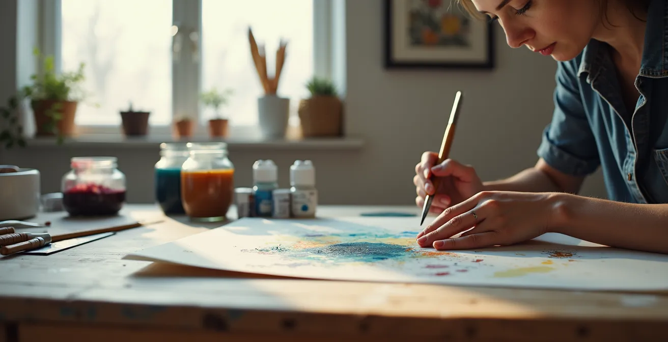
For a perfectionist, frustration is a primary trigger for quitting. You want to follow the rules and achieve a specific outcome, and when the materials fight back, it can feel like a personal failure. This is especially true with watercolor. You might think, “I’m just a beginner, I’ll start with cheap supplies.” This is a critical mistake. Student-grade paper is thin, non-absorbent, and buckles immediately when wet. The paint won’t flow; it will pool and create harsh, unblendable lines. You’ll blame your lack of skill, but the true culprit is the paper.
Investing in a single pad of 100% cotton, artist-grade paper is the most important act of self-compassion you can perform when starting watercolor. This isn’t about snobbery; it’s about removing an unnecessary obstacle. Good paper allows the water to do its magical work, creating soft blends and beautiful gradients. It gives you the time and surface integrity to learn the medium’s properties. By providing your watercolor a proper environment to perform, you’re not just buying paper; you’re buying a chance to experience the intended process without a fight. This significantly lowers the psychological friction of learning.
In fact, the quality of your tools has a measurable effect on your mental state. Recent research demonstrates that participants showed 25% higher relaxation levels when using quality art materials versus budget alternatives. The study suggests this is because high-quality supplies reduce frustration and allow the artist to enter a flow state more easily. Art therapy case studies support this, showing that clients like “Cindy” experienced markedly reduced anxiety when their work environment was upgraded to include better supplies that didn’t sabotage their efforts. Giving yourself good tools is not an indulgence; it’s a foundational part of the therapeutic process.
The “Scribble Method”: How to Start Drawing When You Have Zero Ideas?
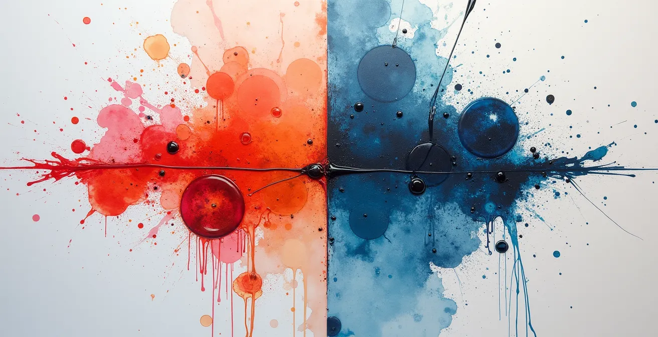
The blank page is a perfectionist’s worst enemy. It represents infinite possibilities, and therefore, infinite ways to fail. The pressure to create something “good” from the very first mark can be completely paralyzing. The “Scribble Method” is a therapeutic technique designed to shatter this paralysis. The goal is simple: make a mark—any mark—without an agenda. Take a pencil or a brush, and let your hand move across the page in a continuous, looping, random line. Don’t try to draw anything. The sole purpose is to break the pristine white of the page and prove to your anxious mind that the first step doesn’t have to be perfect.
Once you have a scribble, the game changes. You are no longer creating from nothing; you are now responding to something. Look at the lines you’ve made. Do you see shapes? Faces? Landscapes? Your brain’s pattern-recognition ability will kick in. You can then begin to define or color in the shapes you see. This transforms the creative act from one of high-pressure invention to one of low-pressure discovery. You’re not a failed master artist; you’re an explorer charting a map that has already appeared. This technique short-circuits the perfectionist’s need for a plan and introduces the joy of spontaneous creation.
This image perfectly captures the essence of starting without a plan. On one side, the gentle, unpredictable bleed of watercolor; on the other, the deliberate, textured mark of acrylic. Both begin as abstract gestures, free from the burden of representation. It is the visual embodiment of the Scribble Method, proving that a beautiful journey can begin with a single, unplanned mark.
A related exercise is a form of “scribbling with paper,” which physically engages your body and short-circuits overthinking. It’s a powerful way to practice letting go of a preconceived outcome and embracing an intuitive process.
Action Plan: An Intuitive Collage Start
- Tear up different colored papers into various sizes and shapes. The physical act of tearing itself can be a therapeutic release of controlled energy.
- Begin gluing pieces onto a blank sheet of paper intuitively. Don’t plan a composition; simply place each piece where it “feels” it wants to go.
- Once pieces are placed, you can use a brush to smear a thin layer of glue over the top of the entire collage to mat the pieces down and create a unified surface.
- Decide when the piece is finished. There is no external rule. The artwork is done when you say it is, which is a powerful exercise in self-trust.
Fixative Spray: How to Stop Your Charcoal Drawings from Smudging?
For a perfectionist, the idea of a finished artwork being fragile and easily ruined can be a source of significant anxiety. You’ve spent hours on a charcoal drawing, and the thought of an accidental smudge undoing your hard work is stressful. This is where a tool like a fixative spray comes in. On a practical level, it’s a varnish in an aerosol can that you spray over a finished dry-media artwork (like charcoal or pastel) to create a protective, permanent layer. It essentially “fixes” the particles to the paper, preventing smudging.
But on a psychological level, fixative represents something deeper: finality and security. The act of spraying the fixative is a ritual that declares, “This is done. It is safe now.” It satisfies the perfectionist’s need for control and preservation. However, this same need for permanence is where the choice between watercolor and acrylic becomes so fascinating. Some mediums offer this finality inherently, while others resist it. This is not a flaw, but a feature that can be used therapeutically.
Perfectionism is exhausting. It often asks us to upkeep appearances that we have it all together while we really feel like falling apart or giving up… It may also hold us back from seeking help because we fear how we will be judged. Perfectionism doesn’t want us to feel comfortable in our shared humanity, because it tells us that we have to be more. Except… it’s never really enough.
– Art Therapy Source, 3 Ways Art Therapy Can Help with Perfectionism and Fear of Failure
This quote gets to the heart of why we seek permanence. The fear of being judged, of not being “enough,” drives us to control our environment and our creations. The table below illustrates how watercolor and acrylic interact with this need for control in fundamentally different ways. Acrylics, once dry, offer the same kind of finality as a fixative. Watercolors, in contrast, remain alive and open to change. Choosing between them is choosing the kind of psychological journey you’re ready for.
| Aspect | Watercolor | Acrylic |
|---|---|---|
| Drying Time | 5-15 minutes | 10-20 minutes |
| Reactivation | Can be re-wet and reworked | Once dry, cannot be re-wetted |
| Finality | Remains ‘alive’ and workable | Dries into unchangeable plastic |
| Protection Needed | Framing behind glass | Varnish application |
Why Does Your Mixed Purple Look Like Mud? (And How to Fix It)
Nothing sends a perfectionist into a spiral of frustration faster than color mixing gone wrong. You had a vision of a vibrant, beautiful purple, but what’s on your palette is a dull, lifeless brown. This “mud” is a common problem, and it usually stems from one of two issues: using the wrong primary colors (a warm red with a cool blue) or over-mixing. For someone who fears making mistakes, this can feel like proof that you’re “bad at art.” But in reality, it’s just a chemistry problem, and one that is entirely fixable.
To get a clean purple, you need to mix a pure red (like Quinacridone Magenta) with a pure blue (like Phthalo Blue). These are “cool” versions of the primaries and don’t have underlying yellow pigments that create mud. This is a technical solution, but the psychological lesson is more important: control comes from knowledge, not force. The frustration you feel isn’t a character flaw; it’s a knowledge gap. Learning a little color theory provides you with a predictable framework, which is incredibly soothing for a mind that craves order.
The medium itself also plays a huge role. In watercolor, colors are transparent and mix on the page, which can feel less controllable. You have to let the water do some of the work. Acrylics, being opaque, offer a very different experience. You mix your exact color on the palette *before* applying it. If it’s wrong, you can adjust it. If you apply it and don’t like it, you can let it dry and paint right over it. For a beginner struggling with color anxiety, acrylics can provide a crucial “safe container.” As a technical guide from ZenART Supplies notes, with acrylics, you can methodically add white in small increments to lighten a color until it’s exactly what you want, a level of precision that can feel very reassuring.
iPad Pro vs. Sketchbook: Is Digital Art “Cheating” or Just Different?
The perfectionist’s inner critic loves to set up arbitrary rules about what constitutes “real” art. A common one today is the debate between digital and traditional media. Is using an iPad with an “undo” button a form of cheating? Does it lack the soul of a physical sketchbook? As an art therapist, the answer is an unequivocal no. The medium is not the point; the creative process is. Whether you are moving pixels or pigment, you are engaging in a dialogue with your mind.
For a perfectionist, the “undo” button on a device like an iPad Pro isn’t a cheat code; it is a revolutionary therapeutic tool. It removes the fear of permanent mistakes, which is often the biggest barrier to starting. It allows you to experiment, to be bold, to try things you would never risk on an expensive piece of paper. This freedom can be the gateway to discovering your style and building confidence. It creates a zero-consequence playground for your creativity. Conversely, the tactile sensation of a pencil on paper, the smell of the wood, and the sound of the graphite can be an incredibly grounding, mindful experience that a screen cannot replicate. The choice isn’t about which is more “authentic,” but which process your nervous system needs right now.
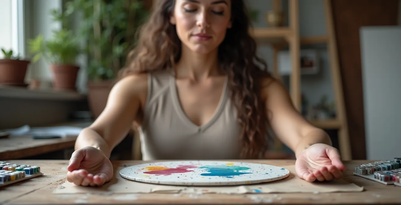
This image of hands covered in paint, working with physical materials, highlights the grounding, tactile experience that traditional media offers. It’s a reminder of the physical connection and sensory feedback that is a core part of the therapeutic process for many.
Ultimately, both paths lead to the same destination: a state of creative flow that promotes well-being. A systematic review of EEG-based art therapy studies confirms this, indicating that the artistic creation process, regardless of the tool, activates emotional processing and self-referential mechanisms that enhance self-acceptance and personal growth. For individuals who struggle to express themselves verbally, art offers a vital alternative pathway for emotional exploration. The tool is just the vehicle; the journey is internal.
Why Painting Your Bedroom Red Might Increase Your Insomnia?
While this question seems to be about interior design, it opens up a crucial topic for any artist: the psychology of color. The colors you choose to surround yourself with—and the colors you choose to paint with—have a direct and measurable impact on your emotional and physiological state. Red, for example, is a highly stimulating color. It can increase heart rate and energy levels. While fantastic for a gym or a creative workspace, it’s often a poor choice for a bedroom, where the goal is to calm the nervous system for sleep. This isn’t just a matter of opinion; it’s rooted in neurophysiology.
As artists, we can harness this power intentionally. If you are feeling low and lethargic, working with warm, energetic colors like oranges and yellows can be invigorating. If you are feeling anxious and overwhelmed, turning to cool, calming colors like blues and greens can have a soothing effect. Your palette can become a form of self-medication. Watercolor, with its soft, transparent layers, is naturally suited for creating calming washes of blue and green. Acrylics, with their bold, opaque nature, can deliver a powerful, energizing punch of red or orange. The choice of medium can amplify the intended emotional effect of the color.
The entire creative process serves as a tool for emotional reintegration. It provides a safe psychological space where you can engage with your inner world. In the words of one research team studying the effects of art therapy:
From a neurophysiological standpoint, limbic system activity tends to stabilize as relaxation levels increase, providing a physiological foundation for emotional reintegration. From a psychological perspective, a high relaxation level creates a safe psychological space for individuals, allowing them to direct their attention toward internal experiences.
– Research team, Effects of electroencephalography-based art therapy on emotion regulation
This “safe psychological space” is what we are building, one brushstroke at a time. By understanding how color affects your mind and body, you gain another layer of control over your therapeutic process, turning your art practice into a sophisticated tool for emotional regulation.
Portrait or Landscape: Which Canvas Shape Corrects a Low Ceiling?
Just as color impacts your psychology, so does shape and orientation. On the surface, choosing between a portrait (vertical) or landscape (horizontal) canvas seems like a simple compositional choice based on your subject. But for a stressed individual, this decision can be used therapeutically to influence your mental state. A landscape orientation often feels expansive, open, and calm. It mimics the horizon line, which our brains associate with stability and peace. Painting on a horizontal canvas can encourage a sense of breadth and freedom in your work and in your mind.
A portrait orientation, on the other hand, can feel more focused, contained, and dynamic. It draws the eye upward, suggesting growth and aspiration. For a mind that feels scattered and overwhelmed, the defined vertical space can provide a welcome sense of structure and focus. It can feel like a psychological container, a defined area within which to work, reducing the anxiety of an infinitely wide, blank space. There is no “right” or “wrong” choice; it’s about asking yourself what your mind needs.
In the context of a room with a low ceiling, a portrait-oriented artwork is a classic interior design trick to create the illusion of height. It draws the viewer’s gaze upward, making the space feel taller and less oppressive. This is a perfect metaphor for how we can use art therapeutically. If you are feeling emotionally “boxed in” or constrained, consciously choosing to work on a vertical canvas can be a symbolic act of creating more “headspace” for yourself. You are not just choosing a shape for a painting; you are actively shaping your own psychological environment.
Key Takeaways
- The choice between watercolor and acrylic is a psychological one: watercolor teaches surrender, while acrylic provides control.
- Fear of failure is the biggest block for perfectionists. Techniques like the “Scribble Method” and using an “undo” button are therapeutic tools, not cheats.
- Your materials matter. Quality paper prevents frustration, and understanding color theory and canvas shape gives you a sense of mastery and calm.
How to Upcycle Glass Jars into Decor Without It Looking like “Trash”?
The act of upcycling—turning a discarded item like a glass jar into something beautiful—is a powerful metaphor for the entire therapeutic process of art-making for a perfectionist. You start with something deemed “worthless” or “trash,” something imperfect and overlooked. The goal is not to make it look like a machine-made, flawless object, but to transform it while honoring its history. This is where the fear comes in: “What if it just looks like a painted jar?” The secret is to embrace the imperfection.
Instead of trying to achieve a perfectly smooth, opaque coat of paint (which is difficult on glass), lean into texture. Use acrylic paints to create patterns, stipples, or abstract layers of color. Wrap the jar in twine or fabric. Use it as a vase for a few wildflowers. The beauty comes from the combination of the humble object and your personal, imperfect touch. It’s about transformation, not concealment. This process directly challenges the perfectionist’s all-or-nothing thinking. The jar is not “trash” or “treasure”; it is a bit of both, made beautiful by an act of creative acceptance.
This mirrors the principles of Acceptance and Commitment Therapy (ACT), which can be beautifully integrated with art therapy. As one practice notes, perfectionism is seen as a strategy to avoid discomfort. Instead of staying present, we get stuck in our heads chasing impossible standards. Art, by its very nature, embraces the unexpected. A case study using ACT explains that “a misplaced brushstroke, an unexpected color blend—these are not mistakes; they are part of the creative process.” Upcycling a jar is a tangible way to practice this acceptance. You are taking something “as is” and adding to it, not trying to erase what it was.
The journey from fear to flow is not about finding the “perfect” medium. It is about building a personal toolkit of strategies—the right paper, a way to start, an understanding of color—that creates a safe space for your creativity to emerge. Whether you choose the intentional surrender of watercolor or the safe container of acrylics, the goal is the same: to engage in a process that calms your mind and reconnects you with your own creative spirit. Begin today by choosing the path that feels most gentle to you.
Frequently Asked Questions About Watercolor vs. Acrylic
Can you use acrylic paint to create a watercolor effect?
Yes, you can use acrylic paints to create a watercolor effect by thinning the acrylic paint with water or by adding a thinning medium.
Which medium is better for beginners dealing with mistakes?
Acrylic paints are easier to use, and any mistakes can be easily fixed. Watercolors can be difficult to learn and any mistakes you make are extremely difficult or impossible to fix. So, when it comes to watercolor vs. acrylic for beginners, acrylics might be the better option.
Can watercolor be applied over dried acrylic paint?
Acrylic paint dries to a flexible type of plastic film that is non-porous, so applying watercolor over acrylic will not work. The watercolors will not adhere to the acrylic paint properly and will come off.