
The secret to a sophisticated interior isn’t just balancing colors, but consciously engineering the sensory signals your environment sends.
- Mastering the mix of warm and cool tones involves managing how undertones react to light, not just following a rigid color ratio.
- Texture and materials provide crucial “haptic feedback” and acoustic properties that are as important as the colors themselves.
Recommendation: Begin by auditing your room’s sensory profile—its light, sound, and textures—before choosing a single paint chip.
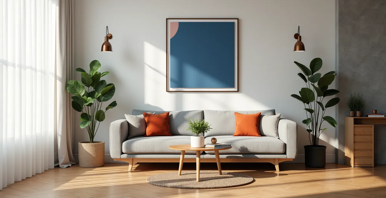
The fear of creating a disjointed, chaotic space paralyzes many homeowners. You’ve likely heard the advice: follow the 60-30-10 rule, pick a neutral to bridge the gap, repeat your accent colors. These are the foundational platitudes of interior design—useful, yet fundamentally incomplete. They treat the room as a static, two-dimensional painting, ignoring the fact that we live in our homes with all our senses. A room that looks balanced in a photograph can feel sterile, loud, or inexplicably “off” in reality.
The true challenge lies in moving beyond simple visual matching. What if the key to harmony was not in the colors themselves, but in how they interact with light, texture, and even sound to create a holistic sensory experience? This is the realm of sensory engineering. It’s an approach that views interior design as the art of composing feelings—warmth, coolness, spaciousness, intimacy—by understanding the scientific and psychological impact of every surface and light source. It’s about understanding why a certain grey on your wall suddenly looks purple, or why a velvet sofa feels intrinsically more comforting than a linen one.
This guide will deconstruct the mechanics of sensory perception in interior design. We will explore how color impacts our biology, how textiles can sculpt the sound of a room, and how the interplay of light and texture can completely alter our perception of space. By the end, you will have a framework not just for choosing colors, but for composing an atmosphere that feels as good as it looks.
Summary: A Guide to Mixing Warm and Cool Tones
- Why Painting Your Bedroom Red Might Increase Your Insomnia?
- How to Dampen Echoes in Open-Plan Homes Using Textiles?
- Velvet vs. Linen: Which Fabric Makes a Small Room Feel Larger?
- The “Undertone Mistake” That Makes Grey Walls Look Purple
- When to Swap Rugs: Transitioning Your Home from Summer to Winter
- Uplighting vs. Downlighting: Which Best Highlights Textured Feature Walls?
- Cork vs. Synthetic Foam: Which Insulates Sound Better for Home Studios?
- Which Beam Angle Is Best for 8-Foot Ceilings to Avoid Glare?
Why Painting Your Bedroom Red Might Increase Your Insomnia?
The notion that color affects mood is ancient, but modern science is beginning to explain the physiological mechanisms. The choice of bedroom color is a prime example of where aesthetic desire can clash with biological function. A vibrant, high-chroma red, while passionate and energetic, is a powerful sensory signal that can directly interfere with sleep. The core of the issue lies not just with the color red itself, but with its relationship to light and our circadian rhythms. Our bodies are tuned to associate the blue light of daytime with wakefulness and the warm, red-toned light of sunset with the winding down of the day.
However, an intense red wall is not the same as a gentle red-hued light. High-saturation colors can be stimulating to the nervous system, increasing heart rate and alertness. More critically, the typical artificial lighting used in homes contains a significant amount of blue light. When this light reflects off a red wall, it still carries the blue-light wavelengths that are known to suppress the production of melatonin, the hormone that regulates sleep. According to sleep science, while red light itself (at a specific wavelength around 700nm) can be beneficial for sleep, a stimulating red-painted environment under standard lighting is counterproductive. The key is to work with color to support, not fight, your body’s natural clock. This involves shifting from high-saturation colors to more complex, low-saturation alternatives like terracotta or dusty rose, which provide warmth without the intense stimulation.
How to Dampen Echoes in Open-Plan Homes Using Textiles?
In modern architecture, the open-plan home is celebrated for its sense of space and light. However, this design often creates an unintended sensory problem: poor acoustics. Sound waves bounce freely off hard surfaces like wood floors, large windows, and plaster walls, resulting in echoes and a lack of auditory intimacy. This is where textiles transition from being purely decorative elements to crucial tools of acoustic engineering. By understanding their sound-absorbing properties, you can create “acoustic sanctuaries” within a larger space.
The effectiveness of a textile in absorbing sound is measured by its Noise Reduction Coefficient (NRC). A material with an NRC of 0 is perfectly reflective, while a material with an NRC of 1 is perfectly absorptive. Different textiles absorb different sound frequencies. As a case study from The Green Room Interiors demonstrates, a multi-layer textile strategy is most effective. This involves using dense wool rugs to absorb low-frequency floor reverberations, wall-mounted elements like acoustic felt panels or heavy tapestries for mid-range frequencies, and plush upholstered furniture for general dampening. The goal is to introduce a variety of soft, porous surfaces that trap sound waves instead of reflecting them.
This table illustrates the varying acoustic capabilities of common interior textiles, guiding the selection process for both visual and auditory comfort. As the data from a comparative analysis of home textiles shows, materials like velvet and wool are far more effective than cotton or linen for acoustic control.
| Textile Type | NRC Rating | Best For | Temperature Feel |
|---|---|---|---|
| Dense Wool Rugs | 0.35-0.45 | Low frequencies | Warm |
| Velvet Curtains | 0.40-0.50 | Mid frequencies | Warm |
| Flatweave Cotton | 0.15-0.25 | Minimal absorption | Cool |
| Sheer Linen | 0.05-0.15 | Light diffusion only | Cool |
Velvet vs. Linen: Which Fabric Makes a Small Room Feel Larger?
The choice between velvet and linen is often framed as a style decision: traditional luxury versus relaxed elegance. From a sensory engineering perspective, however, this choice is a strategic manipulation of light and touch. The fabric that makes a small room feel larger is the one that best manages light. In this contest, linen is the clear winner, due to its higher Light Reflectance Value (LRV). LRV measures the amount of visible light a surface reflects. Linen’s relatively smooth, flat weave and natural sheen allow it to bounce light around a room, creating an airy, expansive feeling. It provides a cool visual and haptic feedback, signaling “space” and “breathability.”
Velvet, conversely, has a deep pile that traps light, giving it a low LRV. This light absorption is what creates its signature deep, rich color and a visual perception of warmth and coziness. While luxurious, this quality can make a small room feel more enclosed and visually “heavy.” A design case study on spatial perception highlights a sophisticated strategy: use the strengths of both. By placing high-LRV linen on large vertical planes, such as curtains, you maximize light reflection and the illusion of height. Then, use velvet on smaller, horizontal planes below eye level—an ottoman, accent pillows—to introduce grounding points of comfort and warmth without overwhelming the space. This approach layers different sensory signals, achieving both an airy feel and a sense of tactile luxury.
The “Undertone Mistake” That Makes Grey Walls Look Purple
This is one of the most common and frustrating phenomena in interior design: you choose a beautiful, neutral grey paint chip, only to find it looks distinctly purple, blue, or green on your walls. This is not a paint defect; it is a perceptual shift caused by the clash of undertones. Every complex color, including grey, has a mass tone (what you see at first glance) and an undertone (the subtle color bias within it). A grey can have a warm undertone (yellow, beige) or a cool one (blue, purple, green). The “undertone mistake” occurs when the undertone of your grey paint clashes with the undertones of other fixed elements in the room, like flooring, furniture, or, most importantly, the natural light.
For instance, a grey with a slight blue undertone placed in a north-facing room (which receives cool, blue-ish light) can have its coolness amplified, making the blue undertone dominant. If that same grey is placed next to warm, yellow-toned wood flooring, the visual contrast can create a phenomenon called chromatic vibration, where the brain exaggerates the difference, often interpreting the cool grey as purple. The only way to avoid this is to test paint colors in situ, on a large scale, and under all lighting conditions. Small paint chips are simply not large enough for your brain to accurately perceive the undertone in context. The solution is methodical and scientific, not guesswork.
Your Action Plan: The Large-Scale Undertone Test
- Points of Contact: Identify the key walls where the grey will be applied and that receive different light (morning, afternoon, artificial).
- Collection: Purchase sample pots of 3-4 grey paints with varied undertones (e.g., blue, green, violet) and paint large (at least 2×2 ft) poster boards.
- Coherence: Move the painted boards to the identified walls throughout the day, confronting them with your fixed elements (flooring, furniture) to check for unwanted color shifts, as detailed in the large-scale sample method.
- Memorability/Emotion: Observe which grey consistently holds its intended character and evokes the desired feeling (calm, crisp) versus turning purple or muddy.
- Integration Plan: Select the winning grey that remains stable and acts as a harmonious bridge between your existing warm and cool elements.
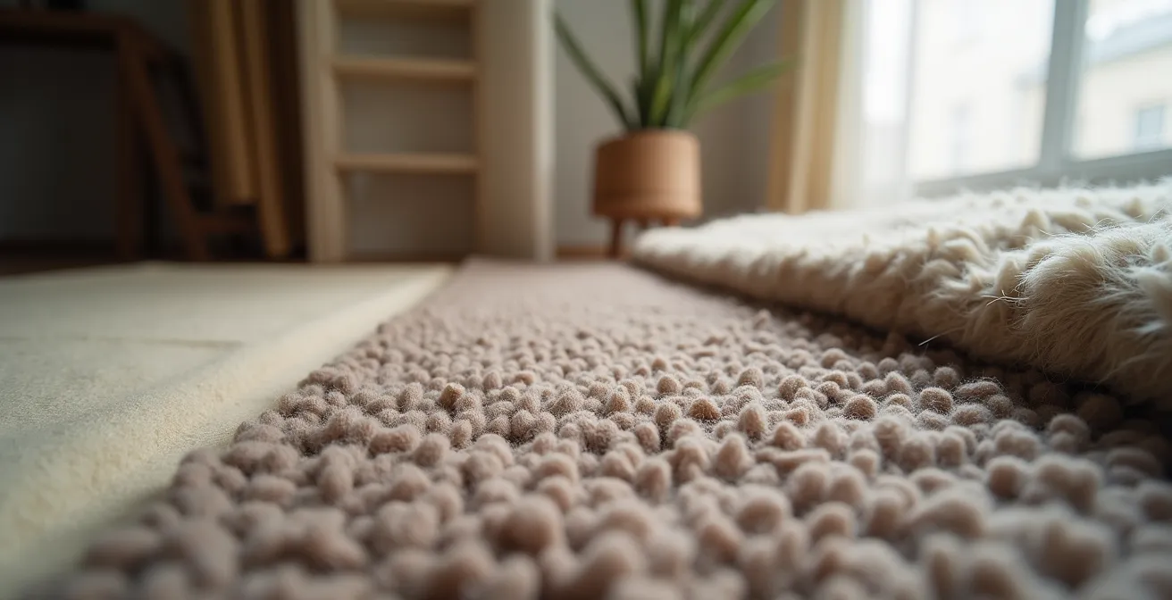
When to Swap Rugs: Transitioning Your Home from Summer to Winter
Adapting your home to the changing seasons is a sophisticated form of sensory engineering. Swapping rugs is one of the most impactful ways to manage this transition, as a rug dictates not only the visual warmth of a room but also its tactile and acoustic properties. The decision of when to swap is tied to both the calendar and the specific sensory cues you want to introduce or remove. In summer, the goal is to create a feeling of coolness and lightness. Materials like jute, sisal, or a thin cotton flatweave are ideal. Their natural, fibrous textures are cool underfoot, and their low pile contributes minimal visual weight, making the space feel more open and airy.

As autumn arrives and the light becomes cooler, the sensory goal shifts to creating warmth, coziness, and insulation. This is the time to introduce a high-pile wool or even a plush sheepskin rug. These materials are visually and physically warm. Their dense fibers are excellent insulators, making the floor feel warmer to the touch, and they also provide significant sound dampening, which contributes to a feeling of quiet intimacy. A transitional strategy, often used in autumn and spring, involves layering these textures—for example, placing a smaller, plush sheepskin over a larger jute rug. This allows for an adaptable environment that offers both the cool base of summer and a concentrated point of wintery comfort.
| Season | Material | Tactile Properties | Visual Weight | Acoustic Properties |
|---|---|---|---|---|
| Summer | Jute/Sisal | Cool underfoot | Light | Minimal dampening |
| Summer | Cotton Flatweave | Breathable, cool | Low pile | Low absorption |
| Winter | Wool | Warm, insulating | Heavy | High sound dampening |
| Winter | Sheepskin | Very warm, soft | Visually cozy | Excellent absorption |
| Transitional | Layered combination | Adaptable | Medium | Moderate |
Uplighting vs. Downlighting: Which Best Highlights Textured Feature Walls?
Light is not a uniform wash; it is a sculptural tool. The direction from which light strikes a surface dramatically alters our perception of its texture, and this is crucial when designing a feature wall. The choice between uplighting and downlighting depends entirely on the sensory message you want the wall’s texture to send. Is it soft and warm, or hard and cool? Uplighting, where fixtures are placed at the base of the wall and aim upward, creates a soft, diffuse ambient glow. It minimizes shadows and is ideal for “warm” textures like limewash, grasscloth, or fabric panels. This technique makes the surface feel gentle and continuous, enhancing a sense of warmth and coziness.
Conversely, downlighting that is aimed to “graze” the wall from the ceiling is designed to create dramatic shadow play. This technique is perfect for “cool,” hard textures like stacked stone, fluted wood panels, or architectural concrete. The sharp angle of the light catches the raised edges of the texture, casting deep shadows that emphasize depth, rhythm, and raw materiality. As a design studio in Toronto demonstrated, the same wall can be made to feel either soft or dramatic simply by changing the lighting direction. For ultimate control, tunable white LED systems allow for dynamic adjustment of both the light’s direction (with adjustable heads) and its color temperature, transitioning from a crisp, cool daylight (5000K) to a warm, ambient evening light (2700K) to perfectly complement the desired mood.
Action Plan: Texture-Based Lighting Selection
- Identify your wall texture type: soft/warm (fabric, limewash) or hard/cool (stone, wood).
- For soft textures, install uplighting fixtures to create a gentle wash of light that reduces shadows.
- For hard textures, position downlights for optimal grazing to create dramatic shadows that highlight the material’s form.
- Consider track lighting with adjustable heads for flexibility, allowing you to change the lighting effect as needed.
- Implement a tunable white LED system to adjust the color temperature of the light throughout the day, enhancing the texture’s natural character.
Cork vs. Synthetic Foam: Which Insulates Sound Better for Home Studios?
When creating a dedicated space for sound, like a home studio or media room, acoustic insulation becomes a primary design requirement. The choice of material is not just about blocking sound, but about absorbing specific frequencies to create a balanced, clear, and controlled auditory environment. Cork and synthetic acoustic foam are two common materials, but they serve very different purposes. Their effectiveness depends entirely on the frequency range you need to control. Acoustic foam, with its open-cell structure, is excellent at absorbing mid-to-high frequencies (from 250 Hz to 4000 Hz). This is the range that includes human speech, most musical instruments, and the harsh flutter echoes that make a room sound sharp and undefined.
Cork, particularly high-density, closed-cell cork, excels at a different task: dampening low-frequency vibrations (from 20 Hz to 250 Hz). This is the “bass” range—the thumping from a subwoofer, the resonance of a bass guitar, or structural vibrations. Cork is less effective at absorbing airborne high frequencies but is superior for decoupling structures and stopping bass from traveling through floors and walls. As a professional home studio case study on hybrid acoustic treatments illustrates, the ideal solution is rarely one or the other, but a zoned, hybrid approach. This involves using cork underlayment on floors and lower walls to handle the bass, while strategically placing foam panels at “first reflection points” (easily found with the “mirror trick”) to manage mid and high frequencies. This creates a truly balanced acoustic environment without over-dampening the room into lifelessness.
| Material | Frequency Range | Best Application | Installation Method | Cost Range |
|---|---|---|---|---|
| Cork (closed-cell) | Low (bass) 20-250 Hz | Floor/wall panels | Adhesive mounting | Medium-High |
| Acoustic Foam (open-cell) | Mid-High 250-4000 Hz | First reflection points | Adhesive strips | Low-Medium |
| Hybrid Solution | Full spectrum | Complete studio treatment | Zoned installation | High |
Key Takeaways
- True color harmony comes from managing sensory inputs (light, texture, sound), not just visual matching.
- Every material choice, from paint undertone to fabric type, sends a distinct sensory signal that affects our perception of space and comfort.
- A scientific, test-driven approach to selecting colors and materials is the best way to prevent common design mistakes and create a truly cohesive environment.
Which Beam Angle Is Best for 8-Foot Ceilings to Avoid Glare?
Mastering the broad strokes of color and texture is essential, but true sensory comfort often lies in the technical details of lighting. For a standard 8-foot ceiling, selecting the correct beam angle for your downlights is the critical factor in creating a pleasant, well-lit space versus an environment filled with uncomfortable glare and harsh shadows. The beam angle refers to the spread of light from a fixture. A narrow beam (15-40°) creates a focused, dramatic spotlight, while a wide beam (60° or more) provides a broad, diffuse wash of ambient light. For general illumination with 8-foot ceilings, a narrow beam is a common mistake; it creates bright “hotspots” on the floor and leaves the upper parts of the room in shadow, often shining directly into the eyes of occupants.
To avoid glare and create an even, comfortable layer of ambient light, a wider beam angle is necessary. Specific lighting research indicates that a 60° to 120° beam angle is generally recommended for 8-foot ceilings. This wide spread allows the light from different fixtures to overlap smoothly, minimizing shadows and creating a uniform brightness. Task lighting (e.g., over a kitchen counter) can still use narrower beams, but they must be aimed carefully to illuminate the work surface without hitting eye level. Furthermore, the fixture itself matters. Using fixtures with recessed bulbs, honeycomb louvers, or frosted lenses helps to diffuse the light source, softening its edge and significantly reducing direct glare. The ultimate goal is to illuminate the room, not the light source itself.
Action Plan: Glare Control for Standard Ceilings
- Calculate room dimensions to determine the number and spacing of fixtures needed for even coverage with wide-angle beams.
- Select wide beam angle (60° or more) fixtures for all general ambient lighting to minimize shadows and ensure smooth light overlap.
- Use narrow beam angles (15-40°) exclusively for task lighting, aimed directly at the work surface and away from sightlines.
- Install honeycomb louvers or frosted lenses on all downlights to diffuse the light source and soften its intensity.
- Position fixtures strategically to avoid direct lines of sight from primary seating or standing positions.
By understanding and applying these principles of sensory engineering, you can move from a decorator who matches colors to an architect of atmosphere. You gain the ability to create spaces that not only look harmonious but also feel intrinsically right—calm, comfortable, and perfectly attuned to the people who inhabit them. To begin this journey, start by performing a sensory audit of your own space, paying attention not just to what you see, but to what you hear, touch, and feel.